La Veta
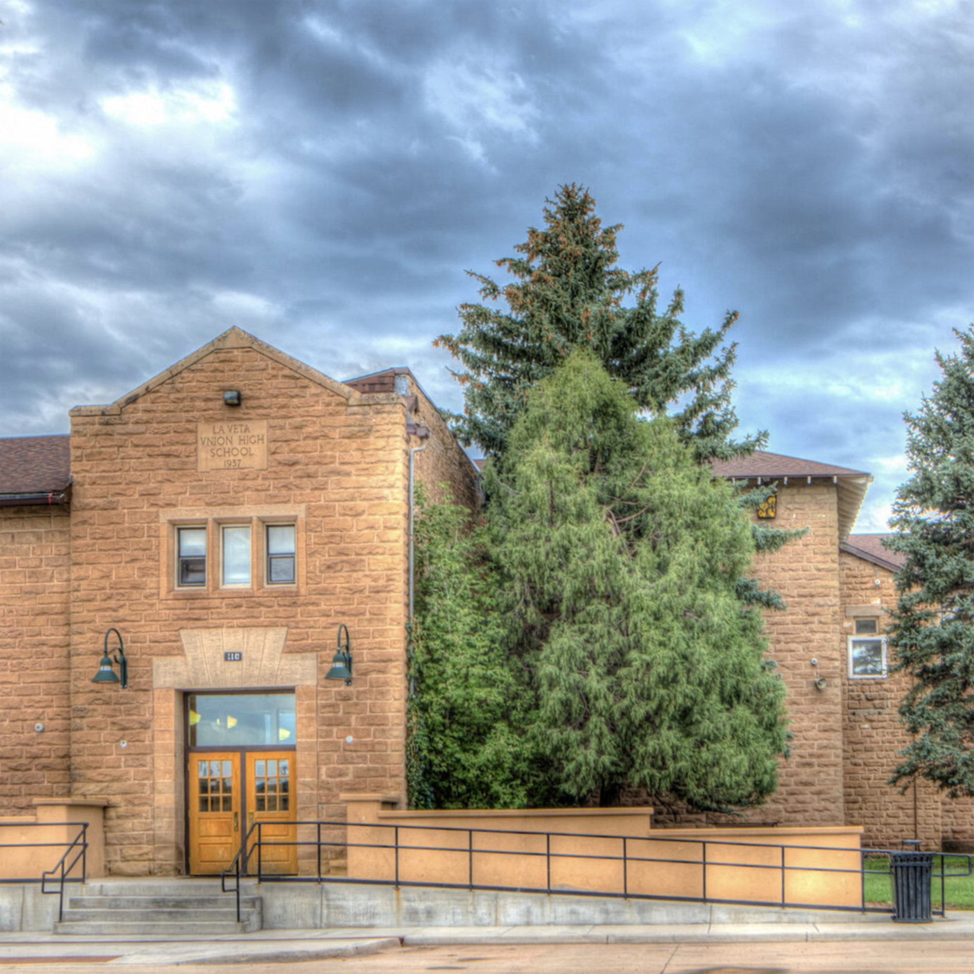
La Veta is a historic town in southern Colorado, rich in Native American, Latin, and European history. With an entirely new school campus built just one mile from its original location, we helped this school and community seamlessly transition to a completely new brand identity.
Services Provided
Brand Strategy
School Logo Design
Athletics Logo Design
School Mascot Design
School Crest Design
Typography
Photography

La Veta is a historic town in southern Colorado, rich in Native American, Latin, and European history. With an entirely new school campus built just one mile from its original location, we helped this community seamlessly transition to a completely new brand identity.
Services Provided
Brand Strategy
School Logo Design
Athletics Logo Design
School Mascot Design
School Crest Design
Typography
Photography

Our Approach
La Vita’s vision for a new brand was clear from the beginning. With such a rich and diverse cultural history, and a need to change from their old mascot (Redskins) to a new less controversial one (Redhawks), we needed to help transition them on many fronts. From an identity that conveyed La Veta’s vision to a broad audience of both students and community members, while simultaneously
celebrating a newly established brand icon that competes with neighboring schools and surrounding communities.
Their new identity had to tie into the geographic area, relate to the community, and ultimately resonate with all students; grades K-12.

School Logo
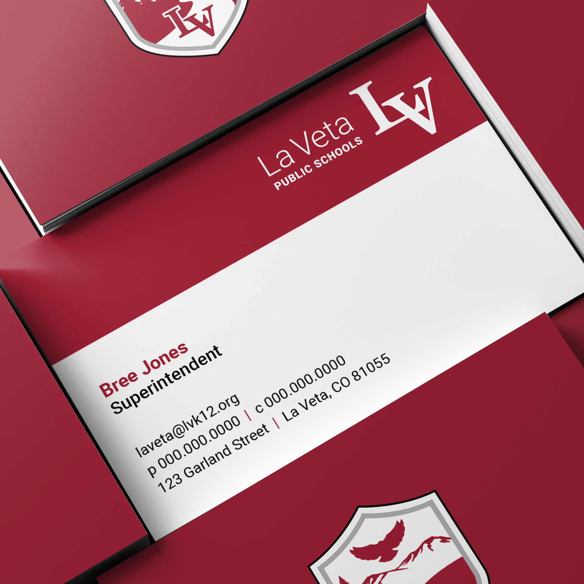
The standard La Veta logo is a modernization of the former logo, belonging to the 106-year-old school. Because the overlapping L and V has been a staple in the community for over a century, it was critical to keep this symbol prominent to the school and the community. Careful steps were taken in coordination with the school board to keep the look of the
historic serif L and V largely intact, however a new, non-italicized typeface was used for these; paired with a very clean sans serf font.
The school mantra is “Pride and Poise”. While the logo pays homage to the past, it conveys strength, trust, and progression for the future.



Athletics Logo
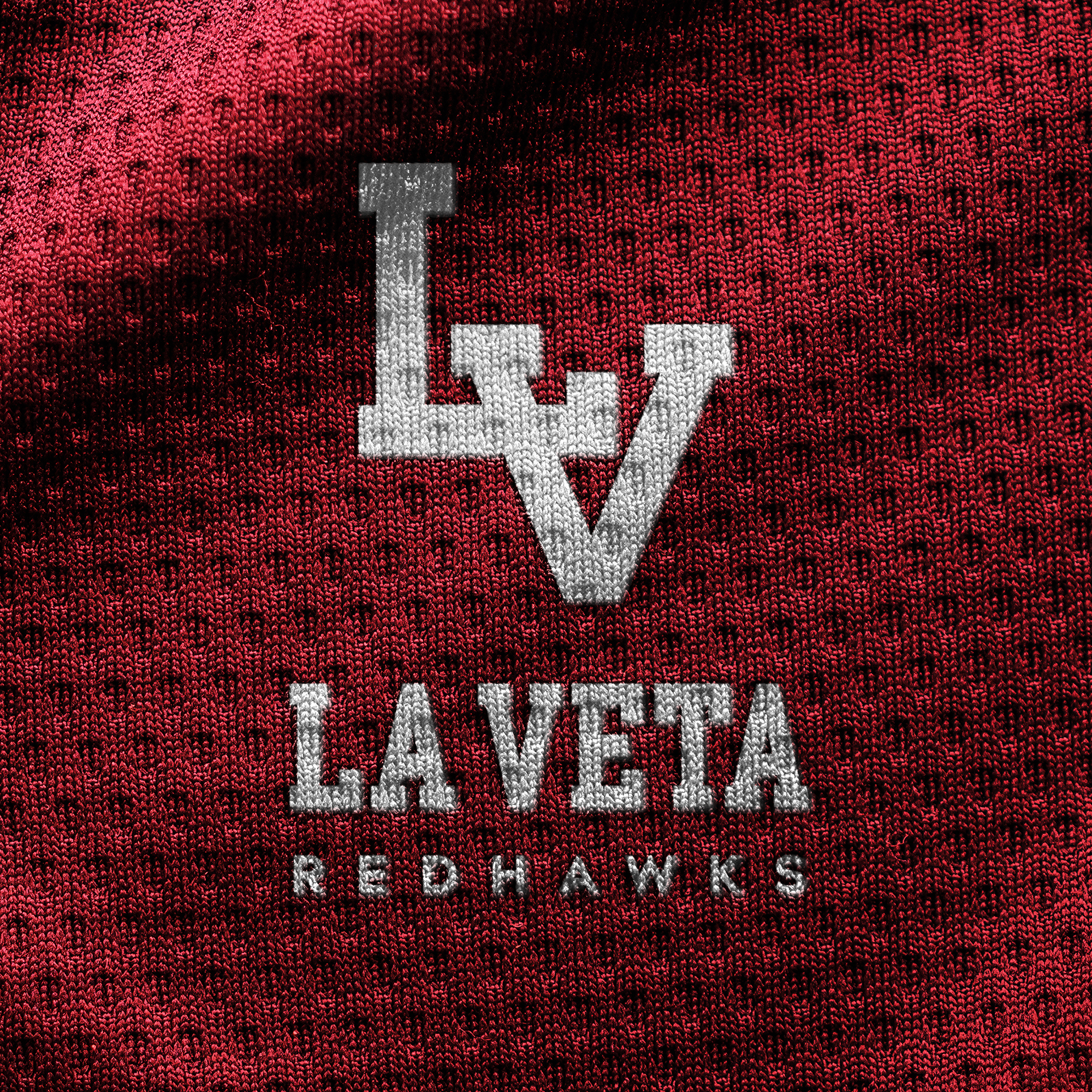
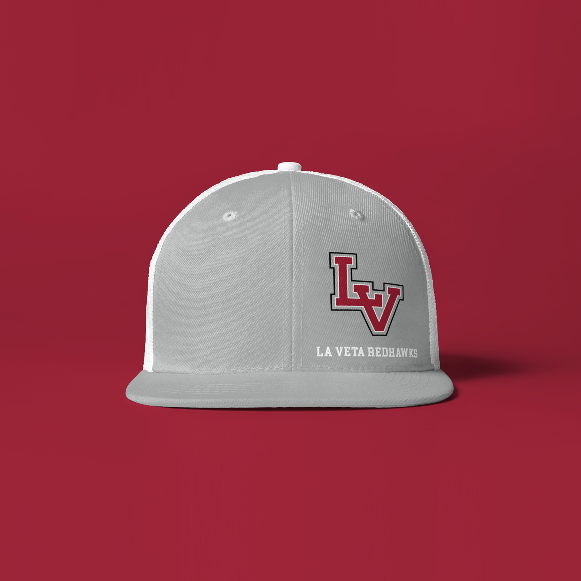
A big item in the design consideration of the new school logo, was introducing to a new dedicated athletics logo, separate from the standard school brand. While again retaining the overlapping L and V, and new block style L
and V were introduced. This helped define the school athletics program by giving it a new identity, while remaining a close sibling of the primary school brand.

School Mascot
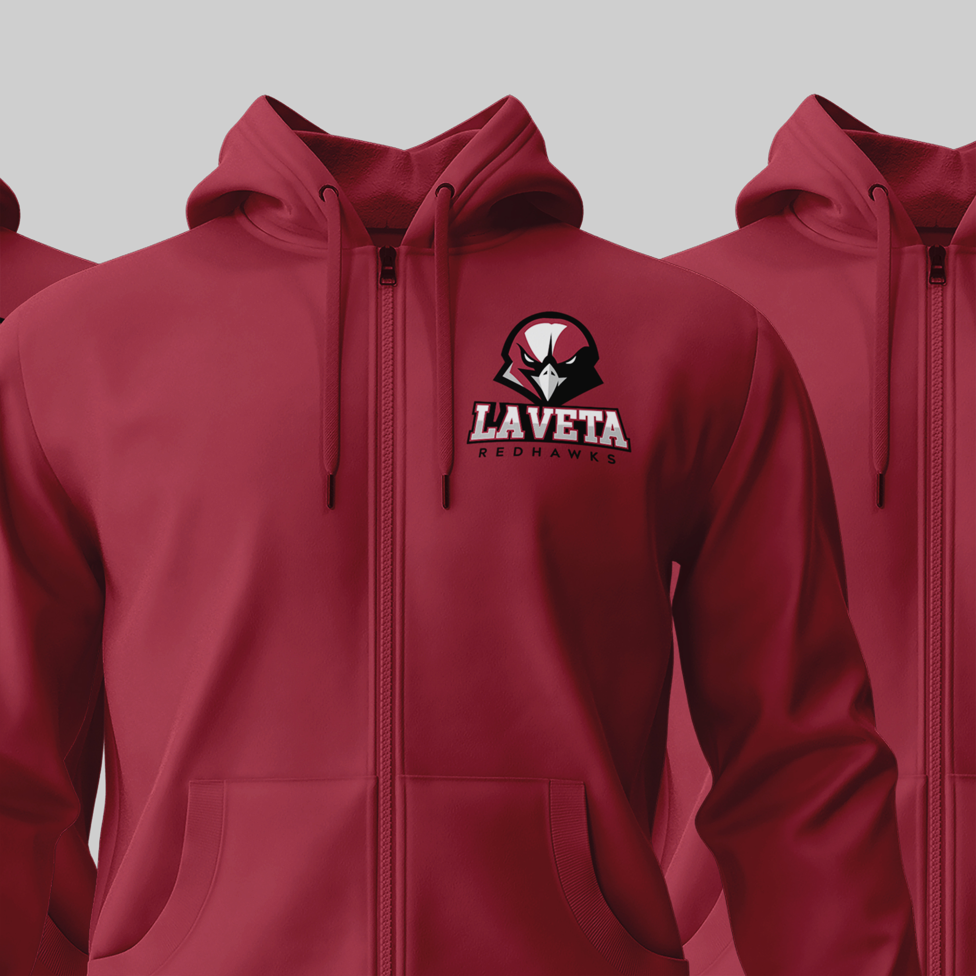
By far the most extensive component with careful consideration for the La Veta rebrand, was the new school mascot.
In lieu of sensitivity surrounding some contemporary mascot names, it was decided that the school mascot would be transitioned from the Redskins, to the Redhawks. While La Veta is rich in Native American history, it was
decided to relate its new mascot to wildlife native to the south central region of Colorado. Bears, Coyotes, and Raptors were all in contention for the new mascot. The Redhawk however is one such regional bird of prey, and so it was decided by the community and school board that its name would become the La Veta Redhawks.


School Crest
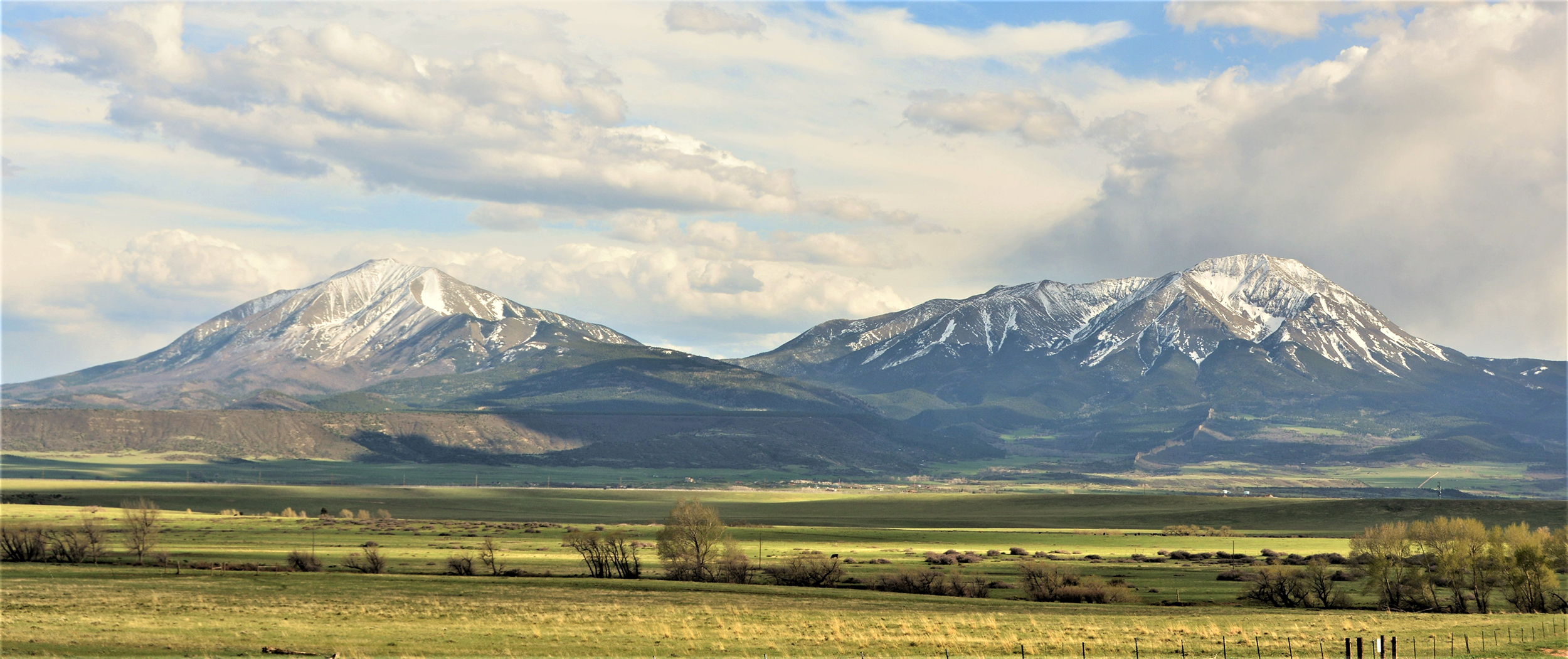
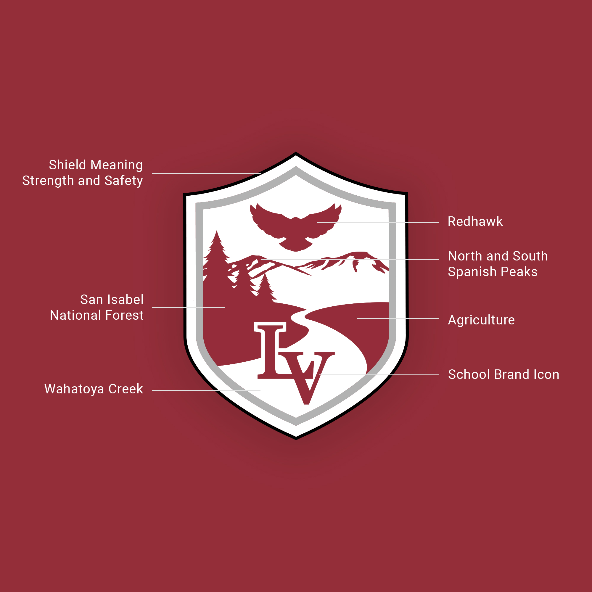
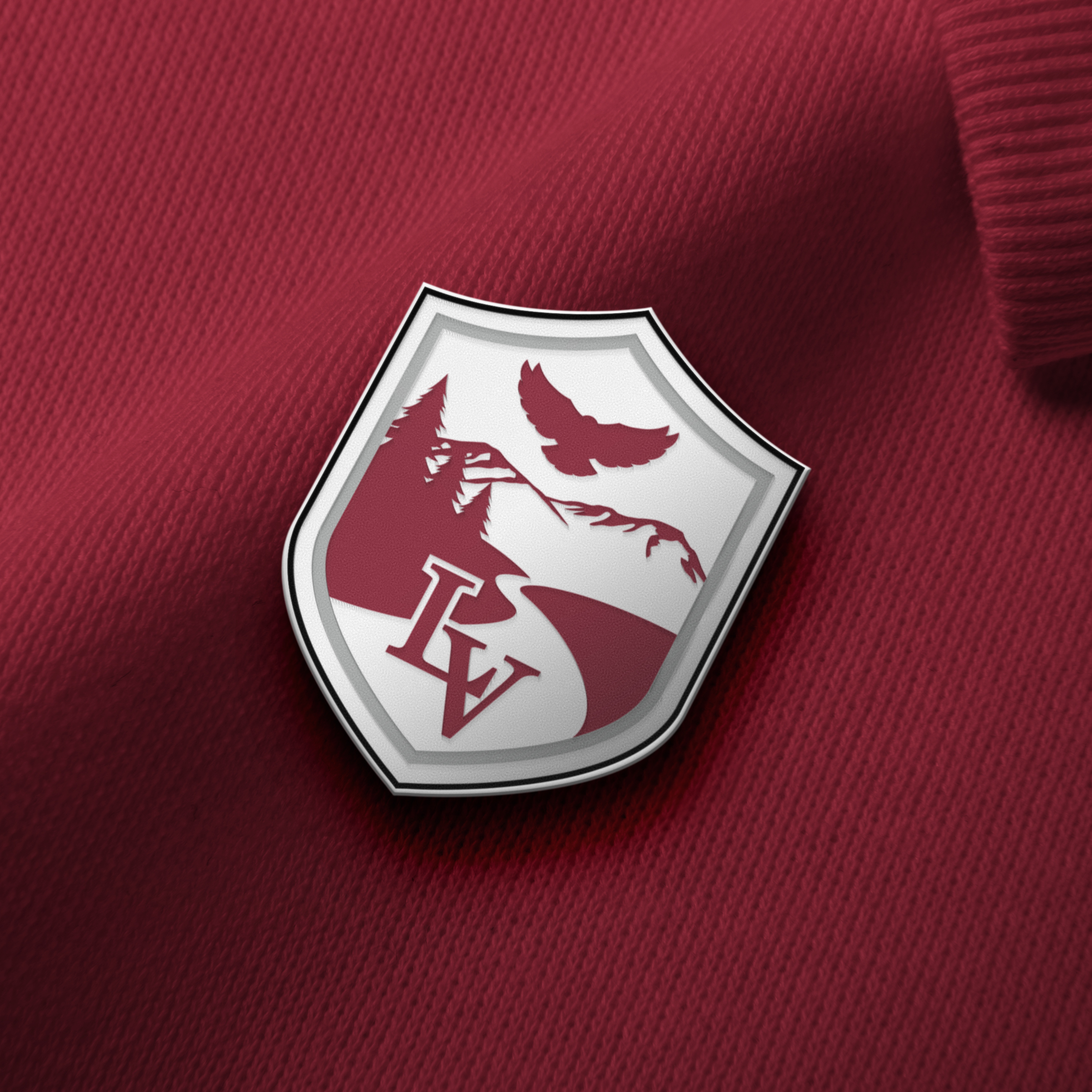
The La Veta school crest design stemmed directly from a combination of several natural features found within its proximity. Because the school is located within the throws of both the East and West Spanish Peaks, the incorporation of these two peaks was foundational to the design. Within the
shadows of the Spanish peaks lies both national forest (San Isabel National Forest) and agricultural farmland. Flowing from the Eastern Spanish Peak is Wahatoya Creek. The Redhawk is also native to the surrounding area, and is a natural predatory bird found throughout the region.
Visual Identity
So long, old, outdated color palette! Hello modern, vibrant color palette!
The new visual system has the school motto built in; “Pride and Poise”. Clean typography
adds status, curated photography feels editorial and genuine. The color palette consists of a vibrant red, crisp white, tones of silver, and a rich black; all of which exude movement and strength.
Typography:
Archerus Grotesque are La Veta’s athletic typefaces. It’s an incredible sans serif family that is slightly condensed and showcases some subtle humanist qualities.



Imagery:
For La Veta, we defined a distinct photography style: we helped them establish a style that emphasized color, evoked emotion, felt fresh, vibrant, and energetic. As a primary style, we wanted to complement the core color palette
by having something that felt warm and inviting with authentic expressions and neutral backgrounds. This simplistic approach also helps contrast other photography styles and the visual language system.


